Sessions 2 and 3

Created Oct 2022, Last updated: 15 December, 2023

What is this page for?

This page has code for session 2 of BPI stats workshop. These exercises will only work if you have completed the pre-session items described here correctly. Go to the Session 1 instructions before these exercises.

Create a new Project

Create a project and work inside it to stay organised. You may continue in the project you created in session 1.

Import data from Excel

We will use data in grafify and the “Weights.xlsx” file we imported previously.

Plotting data

R prefers long data format for plotting. It is always easier to convert wide data table to long using the tidyr package as shown in an example here.

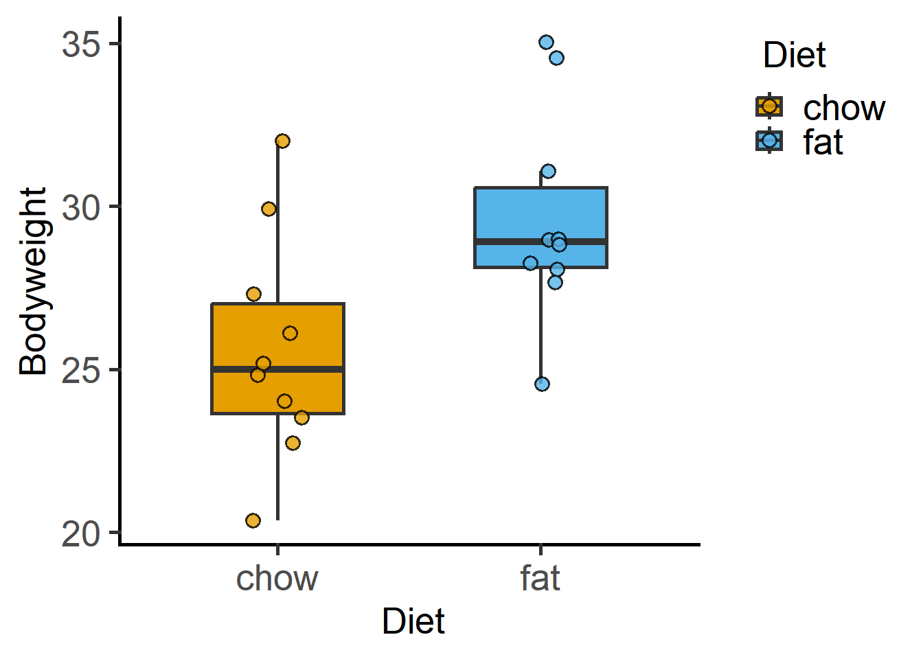
We will use Weights_long for exploratory graphs.

#load grafify
library(grafify)
Loading required package: ggplot2
plot_scatterbox(Weights_long, 
                Diet,
                Bodyweight)

Looking up data in a package

data(package = "grafify") 
data(package = "palmerpenguins")

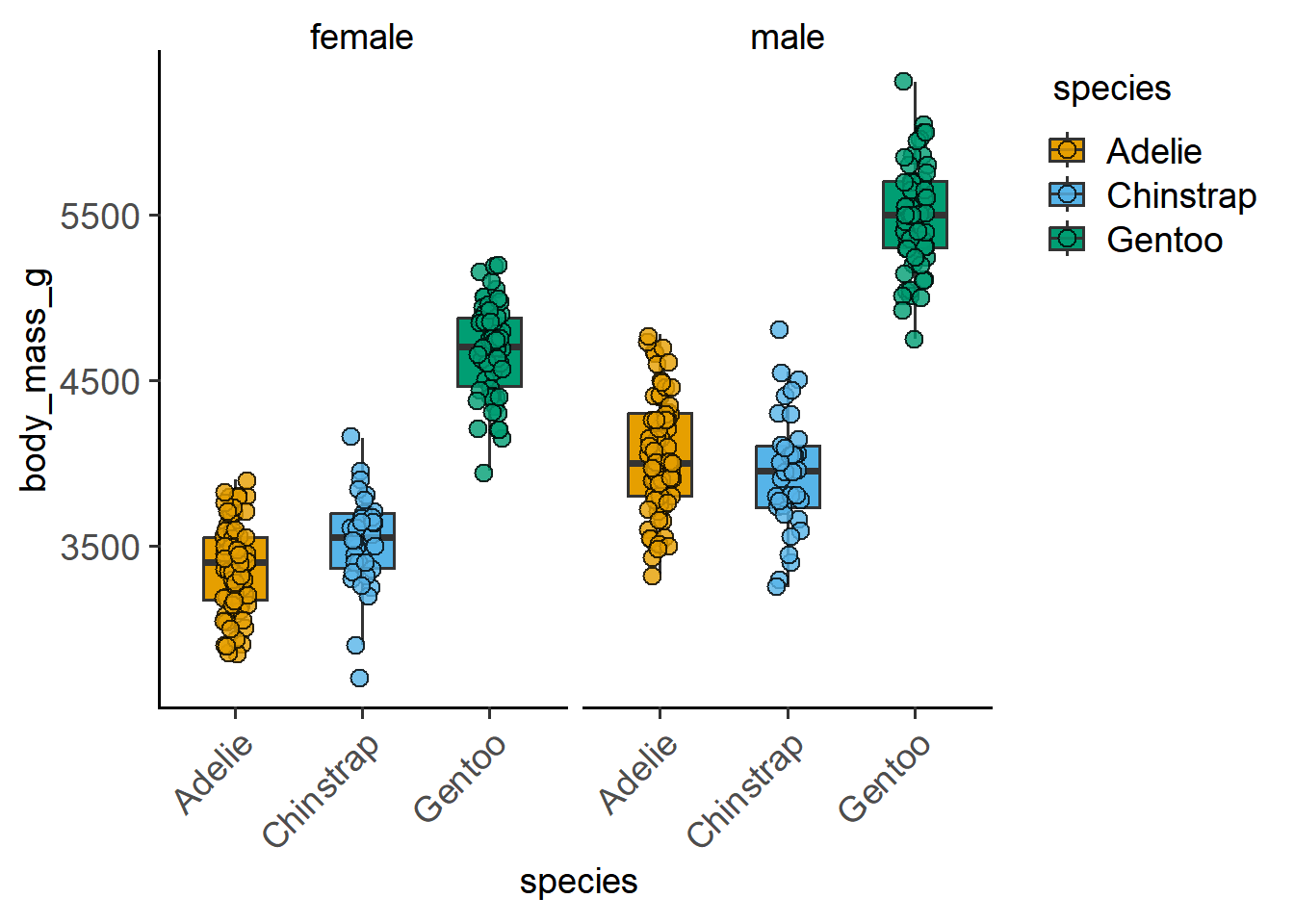
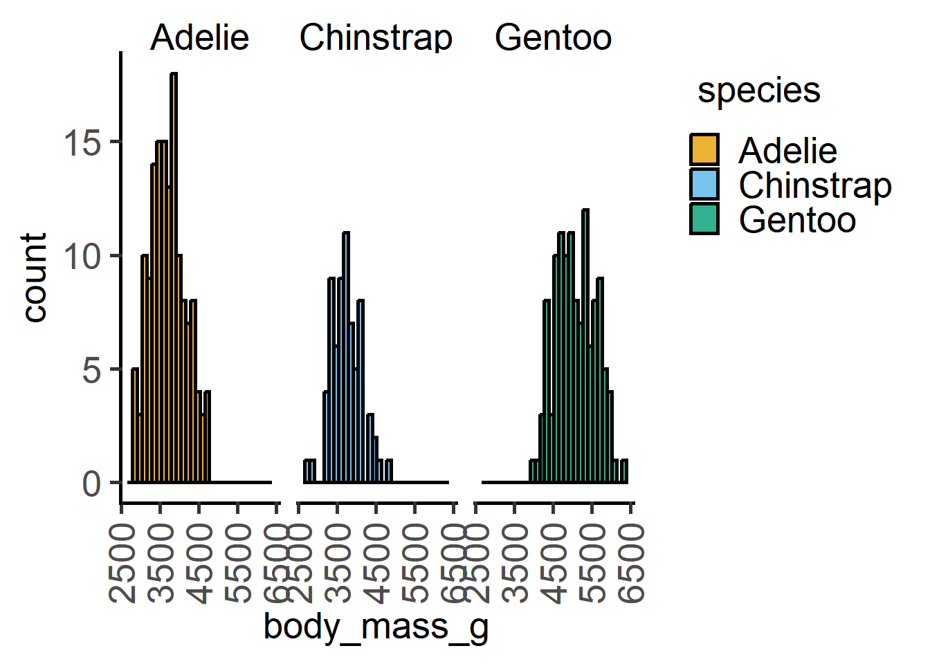
penguins has some rows with no data (NULL or NA), which we will remove for this session (to avoid certain errors – it is not OK to exclude data without good reason!).

library(palmerpenguins) #load the package
#look at data table 
dim(palmerpenguins::penguins) 
[1] 344   8
#remove null data with na.omit 
penguins <- na.omit(palmerpenguins::penguins)
dim(penguins) #table dimensions without null rows
[1] 333   8
str(penguins) #table structure
tibble [333 × 8] (S3: tbl_df/tbl/data.frame)
 $ species          : Factor w/ 3 levels "Adelie","Chinstrap",..: 1 1 1 1 1 1 1 1 1 1 ...
 $ island           : Factor w/ 3 levels "Biscoe","Dream",..: 3 3 3 3 3 3 3 3 3 3 ...
 $ bill_length_mm   : num [1:333] 39.1 39.5 40.3 36.7 39.3 38.9 39.2 41.1 38.6 34.6 ...
 $ bill_depth_mm    : num [1:333] 18.7 17.4 18 19.3 20.6 17.8 19.6 17.6 21.2 21.1 ...
 $ flipper_length_mm: int [1:333] 181 186 195 193 190 181 195 182 191 198 ...
 $ body_mass_g      : int [1:333] 3750 3800 3250 3450 3650 3625 4675 3200 3800 4400 ...
 $ sex              : Factor w/ 2 levels "female","male": 2 1 1 1 2 1 2 1 2 2 ...
 $ year             : int [1:333] 2007 2007 2007 2007 2007 2007 2007 2007 2007 2007 ...
 - attr(*, "na.action")= 'omit' Named int [1:11] 4 9 10 11 12 48 179 219 257 269 ...
  ..- attr(*, "names")= chr [1:11] "4" "9" "10" "11" ...

Let us look at the penguins data set in the palmerpenguins package by plotting “body_mass_g” vs “species” and “sex”.

#boxplot 
plot_scatterbox(data = penguins,                  
                xcol = species,                 
                ycol = body_mass_g)

#add another variable with faceting
plot_scatterbox(data = penguins,                  
                xcol = species,                 
                ycol = body_mass_g,
                facet = sex,
                fontsize = 14,
                TextXAngle = 45)

#add another variable with plot_4d
plot_4d_scatterbox(data = penguins,                  
                   xcol = species,                 
                   ycol = body_mass_g, 
                   boxes = sex,
                   facet = island,
                   fontsize = 14,
                   TextXAngle = 45)

You can change the way the graph looks by tweaking arguments to the plot_* function.

You can change colours and tweak many parameters in these graphs:

  1. Symbol sizes
  2. Symbol and bar opacity
  3. Symbol jitter
  4. Boxplot opacity
  5. Violin opacity
  6. Or have just a single colour along the X variable
  7. Three, four or five variables

We can also have another quantitative variable as another dimension.

#numeric x vs y plot1 
plot_xy_CatGroup(penguins,                  
                 xcol = bill_length_mm,                   
                 ycol = bill_depth_mm,                  
                 CatGroup = species) 

#numeric x vs y plot2 
plot_xy_NumGroup(penguins,                  
                 xcol = bill_length_mm,                   
                 ycol = bill_depth_mm,                  
                 NumGroup = flipper_length_mm)

Data distributions can also be plotted.

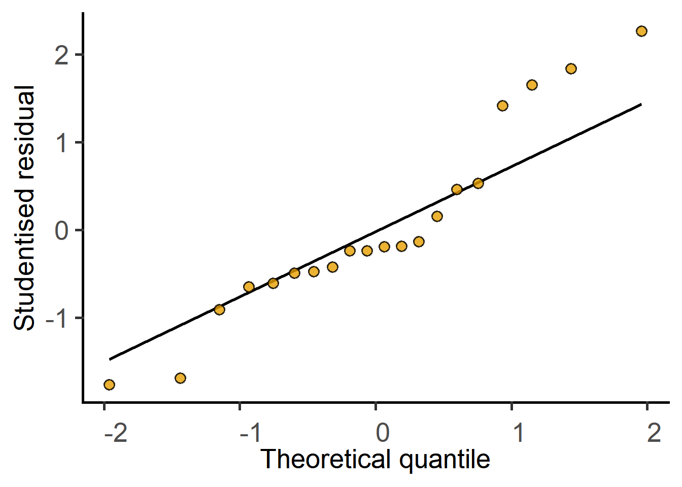
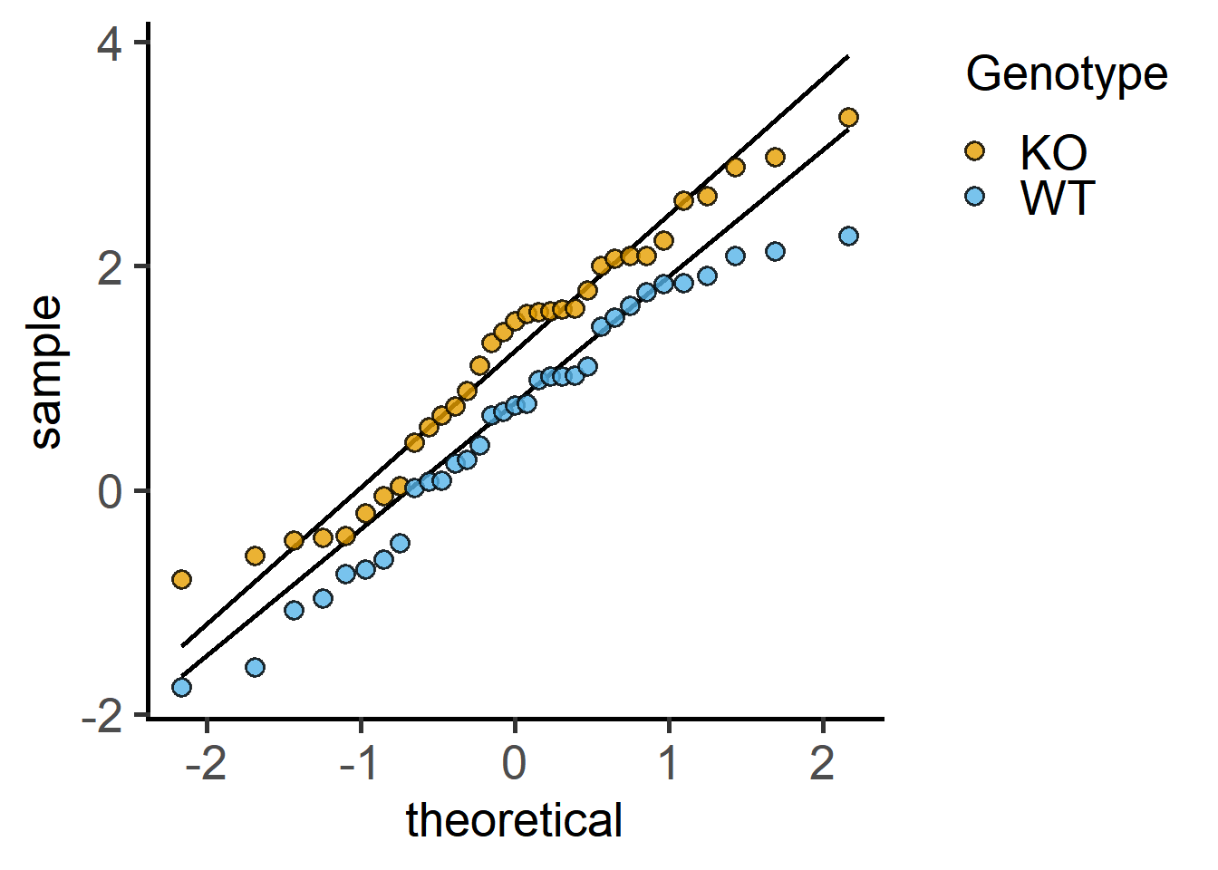
#data distribution - QQ plot 
plot_qqline(penguins,             
            ycol = body_mass_g,             
            group = species)  

#data distribution - histogram 
plot_histogram(penguins,                
               ycol = body_mass_g,                
               group = species,                
               facet = species,                
               TextXAngle = 90)

Student’s t test

t test with long data tables

With long data, we use the formula input, i.e., Y ~ X, where Y is the numeric variable or outcome or dependent variable (this is usually plotted in the Y-axis) and X is the categorical or discrete independent variable (usually on X-axis). The tilde sign ~ is a special character in R used for formula in linear regression. It indicates the variable on the left hand side is predicted by or varies with the variable(s) on right hand side.

#formula with long table
t.test(formula = Bodyweight ~ Diet, #formula input for t.test()
       data = Weights_long)

    Welch Two Sample t-test

data:  Bodyweight by Diet
t = -2.7058, df = 17.892, p-value = 0.01453
alternative hypothesis: true difference in means between group chow and group fat is not equal to 0
95 percent confidence interval:
 -7.1178367 -0.8941633
sample estimates:
mean in group chow  mean in group fat 
            25.603             29.609 

t test with wide data tables

With wide tables, the $ operator is used to point to the two columns containing data to be compared.

#x and y inputs with wide tables 
t.test(x = Weights$chow,  
       y = Weights$fat)

    Welch Two Sample t-test

data:  Weights$chow and Weights$fat
t = -2.7058, df = 17.892, p-value = 0.01453
alternative hypothesis: true difference in means is not equal to 0
95 percent confidence interval:
 -7.1178367 -0.8941633
sample estimates:
mean of x mean of y 
   25.603    29.609 

Output of Student’s t tests

  1. Welch test (default) applies a correction if the SDs of the two groups are not the same. In this example the SDs are slightly different, so we have been penalised by a reduction in the degrees of freedom (df). The df used with Welch’s correction is not a whole number (it is 17.892). The expected df was: total sample size (\(n\)) - 2 = 20 - 2 = 18.
  2. The data used for the analyses.
  3. The test statistic in a Student’s t test is called t, which is a \(signal/noise\) ratio. This is the most important number to look at in t tests. From our data, the test statistic was calculated to be -2.7058. A larger value indicates high difference between the two groups (signal) and low dispersion (noise).
  4. The two-tailed P value is 0.01453. This is the AUC from a t distribution with 17.892 degrees of freedom (df) for t values at least as extreme as \(\pm\) 2.7058.
  5. The 95% confidence interval of the difference between the two group means is also provided.
  6. The means of the two groups are at the end.

Therefore, if the null hypothesis was true, the chance of observing a test statistic at least as extreme as 2.7058 is 0.01453. Given that we usually set \(\alpha\) at 0.05, we may reject the null hypothesis.

Diagnosing a t test

A t test is reliable only if the data in both groups are approximately normally distributed. In reality, with few independently performed experiments (i.e., small sample size), this may be difficult to test. But a strong deviation from normal distribution is a “red flag” (i.e., you should consider data transformations).

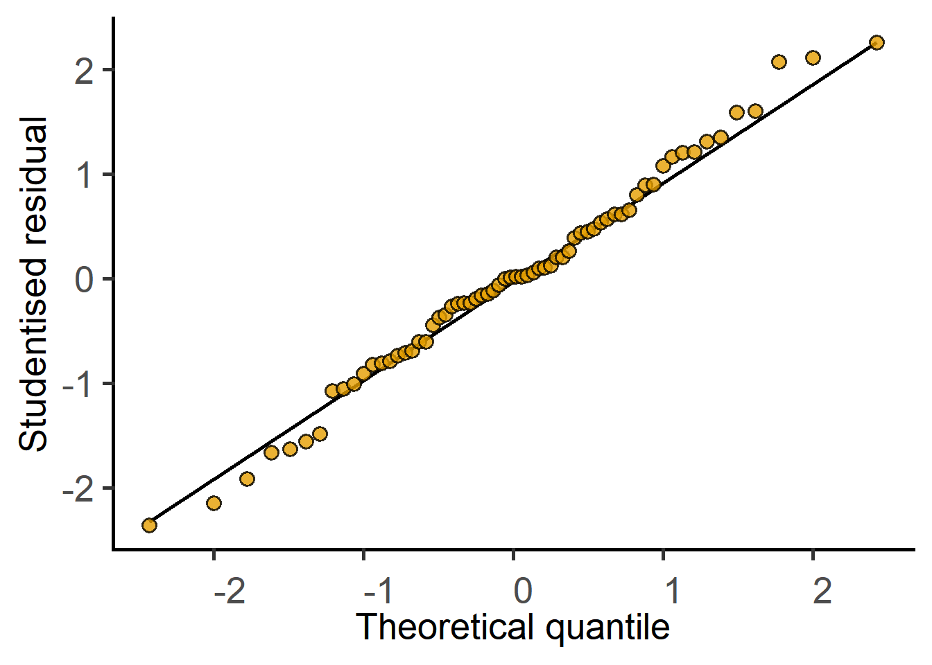
One way to check approximate normal distributions is to plot a QQ plot of both groups before performing the test.

Note: this is only the case for t tests; in ANOVAs (when there are more than 3 groups present), the normality of the residuals from the model should be tested rather than that of the raw data. See the section on t test as a linear model for further details.

plot_qqline(data = Weights_long,
            ycol = Bodyweight,
            group =  Diet,
            facet = Diet)

Reporting a t test

Student’s t test is only appropriate when you are comparing exactly two groups. It is not correct to use multiple t tests when you have multiple groups to compare – you should use ANOVAs. In the statistics section of Methods and/or figure legends, you must report the test, the P value, whether you performed a one- or two-tailed test and whether you had independent or matched data. In the Methods section, you should also mention how experiments were designed, any data transformation and diagnostics performed on model residuals. More formally, the result is reported as follows (but this is uncommon in biology journals): The result of a two-tailed independent group t test were as follows: t (17.892) = -2.71; P = 0.01453. The t statistic and the degrees of freedom give an idea of the sample size and effect size, which is the basis for obtaining the P value and is therefore more informative.

Power of a t test

Let’s first get the mean and SD of the two groups and look at the chance of getting a similar “significant” result with 10 independent draws from the same distributions.

table_summary(data = Weights_long,
              Ycol = "Bodyweight",
              ByGroup = "Diet")
  Diet Bodyweight.Mean Bodyweight.Median Bodyweight.SD Bodyweight.Count
1 chow          25.603            25.005      3.436659               10
2  fat          29.609            28.915      3.179509               10

The mean \(\pm\) SD are 25.603 \(\pm\) 3.4 and 29.609 \(\pm\) 3.18 for chow and fat, respectively.

Let’s try and see how much variability we have in t tests for 10 random numbers drawn from these distributions (i.e., normal distributions with with these mean and SD) using the rnom function.

#rnorm gives random variates from normal distribution
t.test(x = rnorm(n = 10,         #number of variates
                 mean = 25.604,  #mean
                 sd = 3.5),      #sd
       y = rnorm(n = 10,
                 mean = 29.609,
                 sd = 3.18))

    Welch Two Sample t-test

data:  rnorm(n = 10, mean = 25.604, sd = 3.5) and rnorm(n = 10, mean = 29.609, sd = 3.18)
t = -4.664, df = 17.378, p-value = 0.0002107
alternative hypothesis: true difference in means is not equal to 0
95 percent confidence interval:
 -8.755241 -3.307527
sample estimates:
mean of x mean of y 
 24.90183  30.93322 
#repeat 10 times with replicate()
#get P values with $p.value
replicate(t.test(x = rnorm(n = 10, 
                           mean = 25.604, 
                           sd = 3.5),
                 y = rnorm(n = 10,
                           mean = 29.609,
                           sd = 3.18))$p.value,
          n = 10)
 [1] 0.0017088719 0.1966348441 0.0307272577 0.0018186616 0.0001526443
 [6] 0.0080160319 0.0279143119 0.0810041541 0.0084868022 0.0100976948

From these 10 tests, how many have P < \(\alpha\) ?

Estimating the required sample size

The idea is to start with a sufficiently large sample size so we can correctly reject the null hypothesis (when it is false) at least 80 % of repeated sampling. This means a power of 0.8 (i.e., false negative rate \(\beta\) of 0.2; power = 1 - \(\beta\)).

To calculate power, we need to know Cohen’s effect size d. Below we calculate Cohen’s effect size d by hand (difference between the means/pooled SD). The effectsize package has a convenient function to do this for more complex cases (e.g., when the number of both groups is not equal). See an example of how to use it here.

#cohen'd by hand
(25.603-29.609)/((3.4+3.18)/2)
[1] -1.217629
#alternative method
#install the package pwr first
library(pwr) #load the library
#formula input like t.test()
effectsize::cohens_d(Bodyweight ~ Diet, 
                     data = Weights_long)
Cohen's d |         95% CI
--------------------------
-1.21     | [-2.16, -0.24]

- Estimated using pooled SD.
#with wide tables
effectsize::cohens_d(Weights$chow, Weights$fat) 
Cohen's d |         95% CI
--------------------------
-1.21     | [-2.16, -0.24]

- Estimated using pooled SD.
#use the value in the next step
pwr.t.test(n = NULL,    #we want to estimate this             
           d = -1.21,  #effect size
           sig.level = 0.05,  #desired alpha                   
           power = 0.8)       #desired power (1-beta)

     Two-sample t test power calculation 

              n = 11.76412
              d = 1.21
      sig.level = 0.05
          power = 0.8
    alternative = two.sided

NOTE: n is number in *each* group

If you had known the means and SDs before hand (e.g., in a small pilot experiment), you should design the main experiment with 12 mice per group for 80 % power for the experiment. Let’s repeat the simulated t test above with n = 12 to check for increased power as compared to n = 10.

#repeat 10 times and get P values
replicate(t.test(x = rnorm(n = 12, 
                           mean = 25.604, 
                           sd = 3.5),
                 y = rnorm(n = 12,
                           mean = 29.609,
                           sd = 3.18))$p.value,
          n = 10)
 [1] 0.0004494477 0.0007635094 0.0019389181 0.0029603393 0.0019888093
 [6] 0.0025963140 0.0010971401 0.0011048847 0.0012753020 0.0782515707

Paired t tests

This is an exercise for you. The above examples used code for groups with independent sampling. These data are from matched mice!

Repeat the above t tests and power analyses for paired or matched data. You could use the wide table for the t.test and the cohen_d functions with an additional argument paired = TRUE in both functions.

How do the results differ? Is the sample size different if the experiment was designed with independent mice or matched mice?

t test as a linear model

In R linear models (straight lines) can be fit with the function lm. In grafify, this is done with simple_model for independent groups and mixed_model for paired or matched data. See the code below and identify the formula in the outputs.

#for independent groups
simple_model(data = Weights_long,
             Y_value = "Bodyweight",
             Fixed_Factor = "Diet")

Call:
lm(formula = Bodyweight ~ Diet, data = Weights_long)

Coefficients:
(Intercept)      Dietfat  
     25.603        4.006  
#for matched data
mixed_model(data = Weights_long,
            Y_value = "Bodyweight",
            Fixed_Factor = "Diet",
            Random_Factor = "Mouse")
Linear mixed model fit by REML ['lmerModLmerTest']
Formula: Bodyweight ~ Diet + (1 | Mouse)
   Data: Weights_long
REML criterion at convergence: 97.4276
Random effects:
 Groups   Name        Std.Dev.
 Mouse    (Intercept) 2.024   
 Residual             2.619   
Number of obs: 20, groups:  Mouse, 10
Fixed Effects:
(Intercept)      Dietfat  
     25.603        4.006  

Note that the Intercept is the mean of group 1 (chosen alphabetically unless reordered by hand), and Dietfat is the slope, i.e., the difference between the two means. Compare the values of the Intercept and Dietfat (group 2) with the t.test results above. For diagnostics and post-hoc tests, we will need to save the linear model object.

#save the model
weights_model <- simple_model(data = Weights_long,
                              Y_value = "Bodyweight",
                              Fixed_Factor = "Diet")
#use summary() to look at it
summary(weights_model)

Call:
lm(formula = Bodyweight ~ Diet, data = Weights_long)

Residuals:
   Min     1Q Median     3Q    Max 
-5.243 -1.667 -0.694  1.538  6.417 

Coefficients:
            Estimate Std. Error t value Pr(>|t|)    
(Intercept)   25.603      1.047  24.456 2.92e-15 ***
Dietfat        4.006      1.481   2.706   0.0145 *  
---
Signif. codes:  0 '***' 0.001 '**' 0.01 '*' 0.05 '.' 0.1 ' ' 1

Residual standard error: 3.311 on 18 degrees of freedom
Multiple R-squared:  0.2891,    Adjusted R-squared:  0.2496 
F-statistic: 7.321 on 1 and 18 DF,  p-value: 0.01447
#similarly save the mixed effectsmodel

weights_mixed_model <- mixed_model(data = Weights_long,
                                   Y_value = "Bodyweight",
                                   Fixed_Factor = "Diet",
                                   Random_Factor = "Mouse")

summary() shows the full details of the linear model object in R. It has the t statistic for the slope (Dietfat) and the associated P value.

In linear models, the null hypothesis is that slope = 0 i.e., the means of the two groups is the same and a line through the means is parallel to the X-axis. The alternative hypothesis is that the slope != 0 (not equal to 0), i.e., a line joining the two means is not parallel to X with either a positive or negative slope. Do we have evidence to reject the null hypothesis?

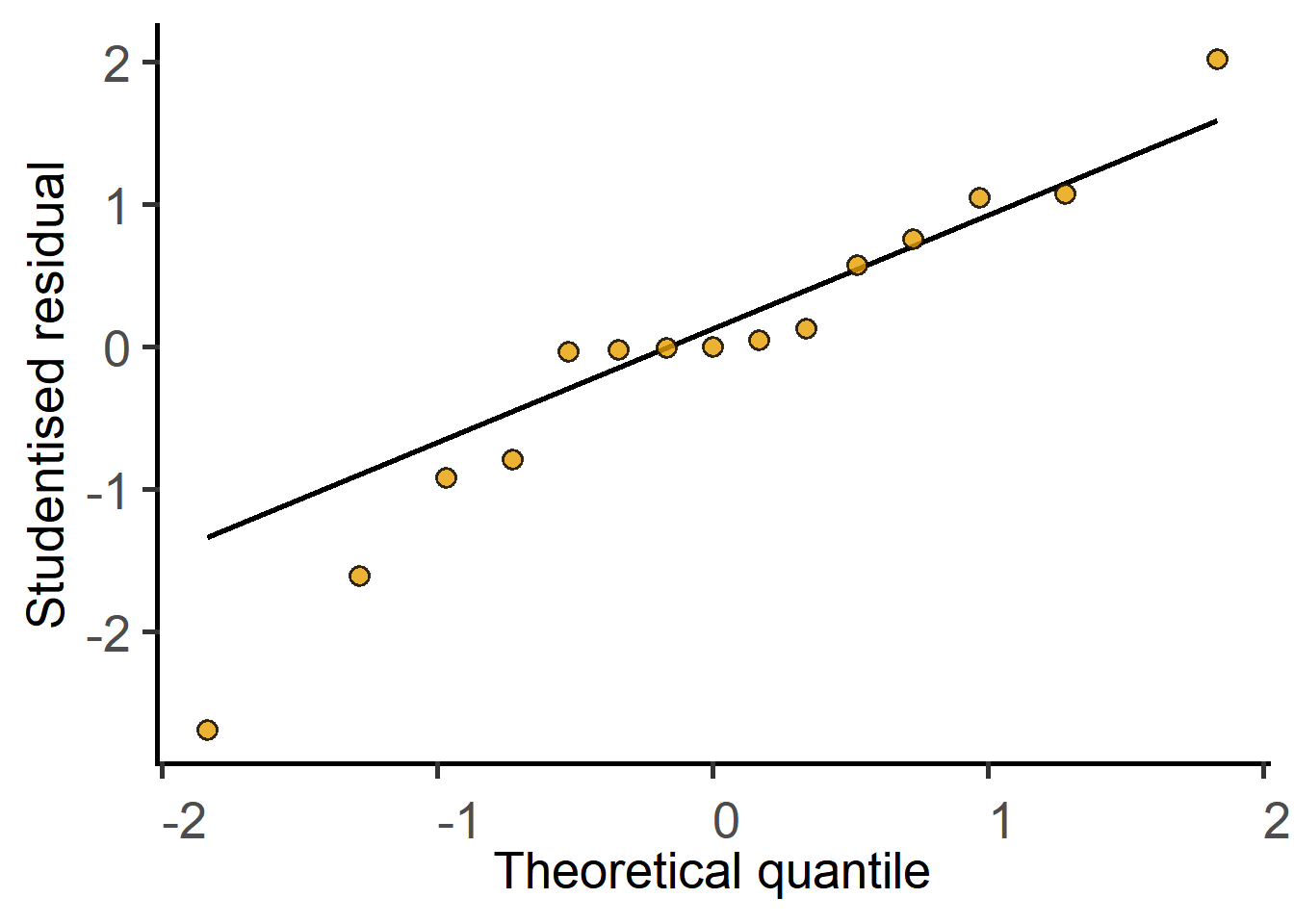
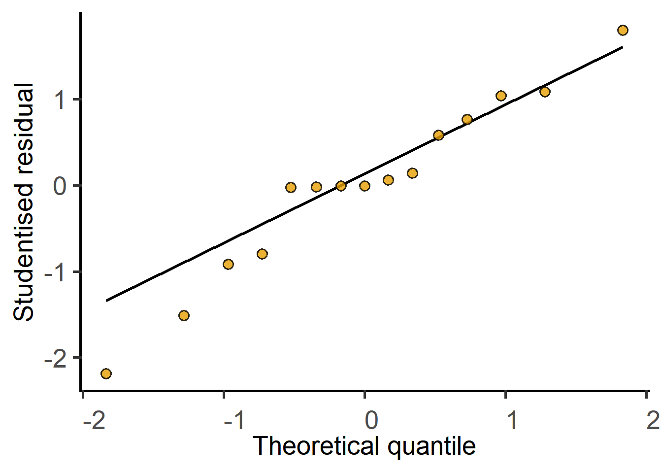
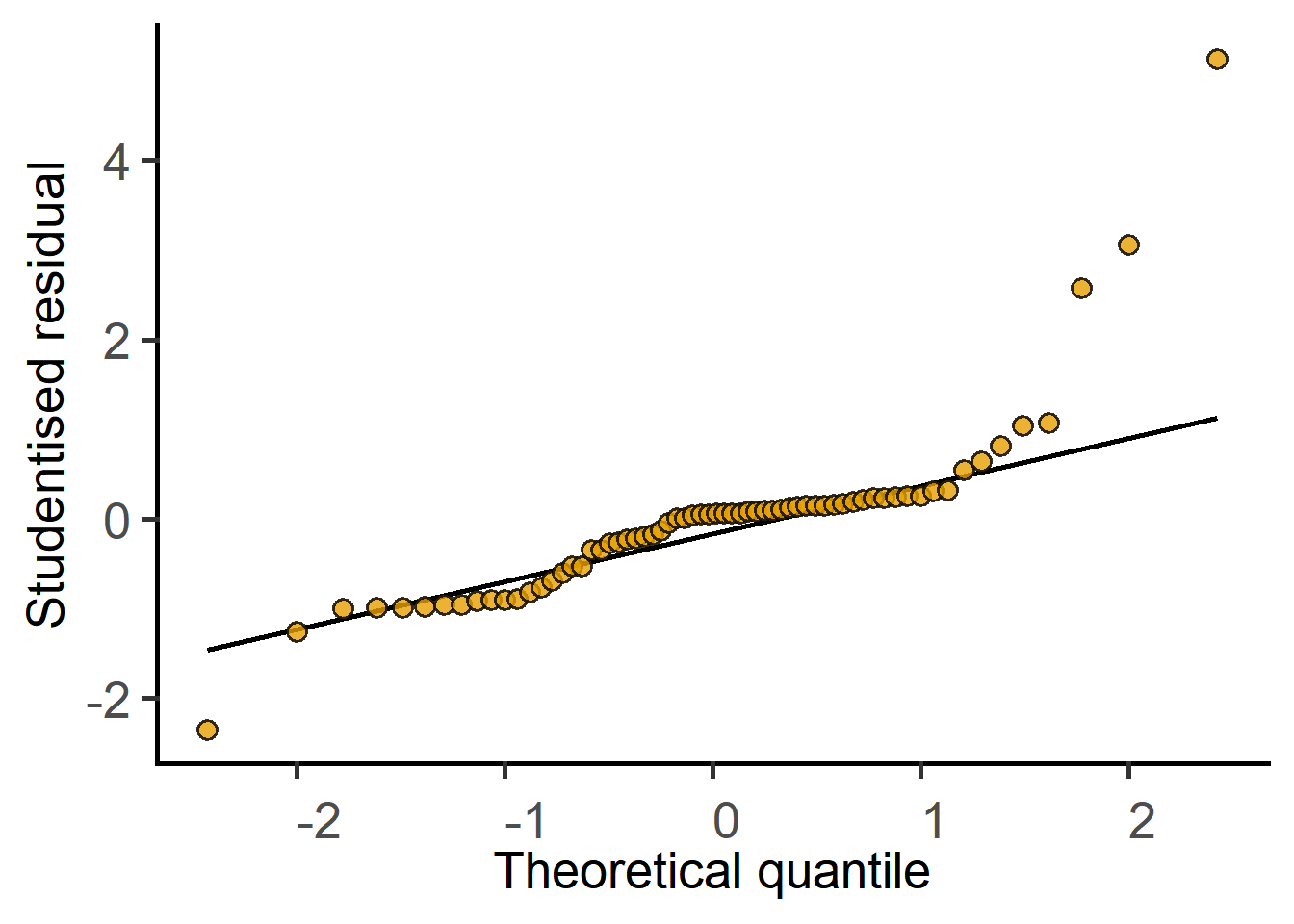
Before answering the above question and accepting the result of the test, we must diagnose the model, i.e., ask whether the straight line is a good fit to the data. If the line is a good fit, the residuals of the model should be approximately normally distributed.

#diagnose by plotting residuals
plot_qqmodel(weights_model)

We can then get the P value for the slope in an ANOVA table format. For balanced designs, the ANOVA F statistic is the square of the t statistic.

#get the result 
simple_anova(data = Weights_long,
             Y_value = "Bodyweight",
             Fixed_Factor = "Diet")
Anova Table (Type II tests)

Response: Bodyweight
          Sum Sq Mean sq Df F value  Pr(>F)  
Diet       80.24   80.24  1  7.3212 0.01447 *
Residuals 197.28   10.96 18                  
---
Signif. codes:  0 '***' 0.001 '**' 0.01 '*' 0.05 '.' 0.1 ' ' 1

As an exercise,

  • repeat the above linear model code for matched mice use the mixed_model
  • diagnose the fitted model
  • get the P value from an ANOVA table with mixed_anova functions with Random_Factor = "Mouse" argument.

Look closely at the results and answer:

  • What is the difference from the simple_model result above?
  • Compare these results with the Student’s t tests above.

Question: did our experimental design with matched mice lead to increased power or should we have used different sets of mice? Which of the two is compatible with 3Rs?

One-way ANOVA

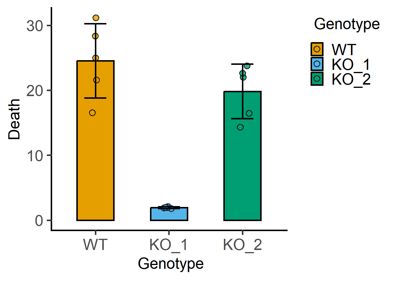
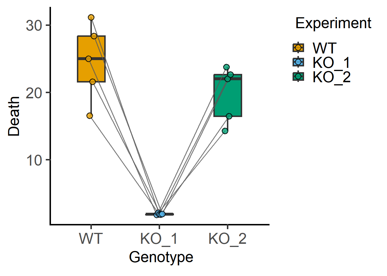
Let’s look at the data_1w_death table from the grafify package.

View(data_1w_death)
str(data_1w_death)
'data.frame':   15 obs. of  3 variables:
 $ Experiment: Factor w/ 5 levels "Exp_1","Exp_2",..: 1 1 1 2 2 2 3 3 3 4 ...
 $ Genotype  : Factor w/ 3 levels "WT","KO_1","KO_2": 1 2 3 1 2 3 1 2 3 1 ...
 $ Death     : num  25.01 1.82 14.29 16.54 2.13 ...

Plot the data

#bar and SD
plot_scatterbar_sd(data_1w_death,
                   Genotype,
                   Death)

Ordinary ANOVA

Here are further instructions for ANOVAs as linear models.

#linear model
lm_1w_1 <- simple_model(data_1w_death,
                        Y_value = "Death",
                        Fixed_Factor = "Genotype")
#model summary includes details
summary(lm_1w_1)

Call:
lm(formula = Death ~ Genotype, data = data_1w_death)

Residuals:
    Min      1Q  Median      3Q     Max 
-7.9834 -1.5226  0.0159  2.4960  6.5997 

Coefficients:
             Estimate Std. Error t value Pr(>|t|)    
(Intercept)    24.526      1.830  13.403 1.40e-08 ***
GenotypeKO_1  -22.586      2.588  -8.727 1.53e-06 ***
GenotypeKO_2   -4.699      2.588  -1.816   0.0945 .  
---
Signif. codes:  0 '***' 0.001 '**' 0.01 '*' 0.05 '.' 0.1 ' ' 1

Residual standard error: 4.092 on 12 degrees of freedom
Multiple R-squared:  0.8761,    Adjusted R-squared:  0.8554 
F-statistic: 42.41 on 2 and 12 DF,  p-value: 3.624e-06
#QQ plot of model residuals
plot_qqmodel(lm_1w_1)

#ANOVA table
simple_anova(data_1w_death,
             Y_value = "Death",
             Fixed_Factor = "Genotype")
Anova Table (Type II tests)

Response: Death
           Sum Sq Mean sq Df F value    Pr(>F)    
Genotype  1420.21  710.10  2  42.412 3.624e-06 ***
Residuals  200.91   16.74 12                      
---
Signif. codes:  0 '***' 0.001 '**' 0.01 '*' 0.05 '.' 0.1 ' ' 1

Mixed effects 1way ANOVA

These data are from randomised block designs, where each experiment is a block. Here are further instructions for linear mixed effects models.

#shapes as per experiments
plot_3d_scatterbar(data_1w_death,
                   Genotype,
                   Death,
                   Experiment)

#explore further
#plot of each experiment
plot_befafter_box(data_1w_death,
                  xcol = Genotype,
                  ycol = Death,
                  match = Experiment)

#fit a mixed effects model
mlm_1w_1 <- mixed_model(data_1w_death,
                        Y_value = "Death",
                        Fixed_Factor = "Genotype", 
                        Random_Factor = "Experiment")
#model summary has details
summary(mlm_1w_1)
Linear mixed model fit by REML. t-tests use Satterthwaite's method [
lmerModLmerTest]
Formula: Death ~ Genotype + (1 | Experiment)
   Data: data_1w_death

REML criterion at convergence: 72.7

Scaled residuals: 
     Min       1Q   Median       3Q      Max 
-1.95132 -0.36509 -0.00545  0.60096  1.60534 

Random effects:
 Groups     Name        Variance Std.Dev.
 Experiment (Intercept)  0.09695 0.3114  
 Residual               16.64594 4.0799  
Number of obs: 15, groups:  Experiment, 5

Fixed effects:
             Estimate Std. Error      df t value Pr(>|t|)    
(Intercept)    24.526      1.830  11.999  13.403 1.40e-08 ***
GenotypeKO_1  -22.586      2.580   7.999  -8.753 2.27e-05 ***
GenotypeKO_2   -4.699      2.580   7.999  -1.821    0.106    
---
Signif. codes:  0 '***' 0.001 '**' 0.01 '*' 0.05 '.' 0.1 ' ' 1

Correlation of Fixed Effects:
            (Intr) GnKO_1
GenotypKO_1 -0.705       
GenotypKO_2 -0.705  0.500
#QQ plot of model
plot_qqmodel(mlm_1w_1)

#ANOVA table
mixed_anova(data_1w_death,
            Y_value = "Death",
            Fixed_Factor = "Genotype", 
            Random_Factor = "Experiment")
Type II Analysis of Variance Table with Kenward-Roger's method
         Sum Sq Mean Sq NumDF DenDF F value    Pr(>F)    
Genotype 1420.2   710.1     2     8  42.659 5.401e-05 ***
---
Signif. codes:  0 '***' 0.001 '**' 0.01 '*' 0.05 '.' 0.1 ' ' 1

Two-way ANOVA

Plot the data

The data_2w_Festing data table is available in grafify package.

View(data_2w_Festing)
str(data_2w_Festing)
'data.frame':   16 obs. of  4 variables:
 $ Block    : Factor w/ 2 levels "A","B": 1 1 1 1 1 1 1 1 2 2 ...
 $ Treatment: Factor w/ 2 levels "Control","Treated": 1 2 1 2 1 2 1 2 1 2 ...
 $ Strain   : Factor w/ 4 levels "129/Ola","A/J",..: 4 4 3 3 2 2 1 1 4 4 ...
 $ GST      : int  444 614 423 625 408 856 447 719 764 831 ...

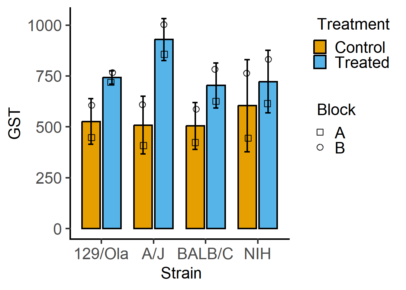
Plot GST vs the two factors “Strain” and “Treatment”. The question we’re addressing is whether GST levels depend on treatment across the strains of mice.

plot_4d_scatterbar(data_2w_Festing,
                   ycol = GST,
                   xcol = Strain,
                   bars = Treatment,
                   shapes = Block)

Mixed effects 2way ANOVA

This is a randomised block design, which we will analyse with mixed effects analyses in grafify as a random intercepts linear model.

mlm_2w <- mixed_model(data_2w_Festing, 
                      Y_value = "GST",
                      Fixed_Factor = c("Strain", "Treatment"),
                      Random_Factor = "Block")
#QQ plot of model residuals
plot_qqmodel(mlm_2w)

#summary of model
summary(mlm_2w)
Linear mixed model fit by REML. t-tests use Satterthwaite's method [
lmerModLmerTest]
Formula: GST ~ Strain * Treatment + (1 | Block)
   Data: data_2w_Festing

REML criterion at convergence: 95.9

Scaled residuals: 
    Min      1Q  Median      3Q     Max 
-1.3603 -0.2462  0.0000  0.2462  1.3603 

Random effects:
 Groups   Name        Variance Std.Dev.
 Block    (Intercept) 15162    123.14  
 Residual              2957     54.38  
Number of obs: 16, groups:  Block, 2

Fixed effects:
                              Estimate Std. Error      df t value Pr(>|t|)   
(Intercept)                    526.500     95.183   1.356   5.531  0.06830 . 
StrainA/J                      -18.000     54.381   7.000  -0.331  0.75033   
StrainBALB/C                   -22.000     54.381   7.000  -0.405  0.69788   
StrainNIH                       77.500     54.381   7.000   1.425  0.19714   
TreatmentTreated               216.000     54.381   7.000   3.972  0.00538 **
StrainA/J:TreatmentTreated     204.500     76.906   7.000   2.659  0.03251 * 
StrainBALB/C:TreatmentTreated  -17.000     76.906   7.000  -0.221  0.83136   
StrainNIH:TreatmentTreated     -97.500     76.906   7.000  -1.268  0.24541   
---
Signif. codes:  0 '***' 0.001 '**' 0.01 '*' 0.05 '.' 0.1 ' ' 1

Correlation of Fixed Effects:
            (Intr) StrA/J StBALB/C StrNIH TrtmnT SA/J:T SBALB/C:
StrainA/J   -0.286                                              
StranBALB/C -0.286  0.500                                       
StrainNIH   -0.286  0.500  0.500                                
TretmntTrtd -0.286  0.500  0.500    0.500                       
StrnA/J:TrT  0.202 -0.707 -0.354   -0.354 -0.707                
StBALB/C:TT  0.202 -0.354 -0.707   -0.354 -0.707  0.500         
StrnNIH:TrT  0.202 -0.354 -0.354   -0.707 -0.707  0.500  0.500  
#ANOVA table
mixed_anova(data_2w_Festing, 
            Y_value = "GST",
            Fixed_Factor = c("Strain", "Treatment"),
            Random_Factor = "Block")
Type II Analysis of Variance Table with Kenward-Roger's method
                 Sum Sq Mean Sq NumDF DenDF F value    Pr(>F)    
Strain            28613    9538     3     7  3.2252   0.09144 .  
Treatment        227529  227529     1     7 76.9394 5.041e-05 ***
Strain:Treatment  49591   16530     3     7  5.5897   0.02832 *  
---
Signif. codes:  0 '***' 0.001 '**' 0.01 '*' 0.05 '.' 0.1 ' ' 1

Post-hoc comparisons

Functions in grafify can do this along with false-discovery rate based correction for multiple comparisons (as default).

For the one-way ANOVA analyses above, let’s compare whether KO1 and KO2 are statistically different from WT. We consider the WT level to be the ‘reference’ level, and use posthoc_vsRef, which requires the fitted linear model and factor name(s).

#default Ref_level = 1
#alphabetically the first level
#unless reordered with factor()
posthoc_vsRef(Model = mlm_1w_1, 
              Fixed_Factor = "Genotype")
$emmeans
 Genotype emmean   SE df lower.CL upper.CL
 WT        24.53 1.83 12    20.54    28.51
 KO_1       1.94 1.83 12    -2.05     5.93
 KO_2      19.83 1.83 12    15.84    23.81

Degrees-of-freedom method: kenward-roger 
Confidence level used: 0.95 

$contrasts
 contrast  estimate   SE df t.ratio p.value
 KO_1 - WT    -22.6 2.58  8  -8.753  <.0001
 KO_2 - WT     -4.7 2.58  8  -1.821  0.1061

Degrees-of-freedom method: kenward-roger 
P value adjustment: fdr method for 2 tests 
#all vs all comparison
posthoc_Pairwise(Model = mlm_1w_1,
                 Fixed_Factor = "Genotype")
$emmeans
 Genotype emmean   SE df lower.CL upper.CL
 WT        24.53 1.83 12    20.54    28.51
 KO_1       1.94 1.83 12    -2.05     5.93
 KO_2      19.83 1.83 12    15.84    23.81

Degrees-of-freedom method: kenward-roger 
Confidence level used: 0.95 

$contrasts
 contrast    estimate   SE df t.ratio p.value
 WT - KO_1       22.6 2.58  8   8.753  0.0001
 WT - KO_2        4.7 2.58  8   1.821  0.1061
 KO_1 - KO_2    -17.9 2.58  8  -6.932  0.0002

Degrees-of-freedom method: kenward-roger 
P value adjustment: fdr method for 3 tests 

For the two-way ANOVA analyses above, let’s compare whether each Strain is affected by Treatment. For this we will use posthoc_Levelwise (e.g., to test whether GST at each level of Treatment has an effect at each level of Strain).

posthoc_Levelwise(Model = mlm_2w,
                  Fixed_Factor = c("Treatment",
                                   "Strain"))
$emmeans
Strain = 129/Ola:
 Treatment emmean   SE   df lower.CL upper.CL
 Control      526 95.2 1.36   -140.0     1193
 Treated      742 95.2 1.36     76.0     1409

Strain = A/J:
 Treatment emmean   SE   df lower.CL upper.CL
 Control      508 95.2 1.36   -158.0     1175
 Treated      929 95.2 1.36    262.5     1595

Strain = BALB/C:
 Treatment emmean   SE   df lower.CL upper.CL
 Control      504 95.2 1.36   -162.0     1171
 Treated      704 95.2 1.36     37.0     1370

Strain = NIH:
 Treatment emmean   SE   df lower.CL upper.CL
 Control      604 95.2 1.36    -62.5     1270
 Treated      722 95.2 1.36     56.0     1389

Degrees-of-freedom method: kenward-roger 
Confidence level used: 0.95 

$contrasts
Strain = 129/Ola:
 contrast          estimate   SE df t.ratio p.value
 Control - Treated     -216 54.4  7  -3.972  0.0054

Strain = A/J:
 contrast          estimate   SE df t.ratio p.value
 Control - Treated     -420 54.4  7  -7.733  0.0001

Strain = BALB/C:
 contrast          estimate   SE df t.ratio p.value
 Control - Treated     -199 54.4  7  -3.659  0.0081

Strain = NIH:
 contrast          estimate   SE df t.ratio p.value
 Control - Treated     -118 54.4  7  -2.179  0.0657

Degrees-of-freedom method: kenward-roger 

Reporting ANOVAs

One-way or factorial (two or more factors) ANOVAs used when there are more than two groups to compare. In the Methods and/or figure legends, clarify what kind of ANOVA was performed, which groups are being compared and respective P values. In the Methods, provide as many details as required to understand the experimental design. More formally, ANOVAs are reported along with the F statistic and the degrees of freedoms. F(2, 8) = 42.659; P = 5.401e-05 for the one-way mixed effects analyses above.

Data transformation

We will use the data_t_pratio data set from grafify. Look at the variables and perform exploratory plots.

Plots of paired or matched data are also called before-after plots.

#example 1
plot_befafter_box(data_t_pratio,
                  xcol = Genotype,
                  ycol = Cytokine,
                  match = Experiment,
                  LogYTrans = "log10")

#example 2
plot_befafter_colors(data_t_pratio,
                     xcol = Genotype,
                     ycol = Cytokine,
                     match = Experiment,
                     Boxplot = TRUE,
                     LogYTrans = "log10")+
  guides(fill = "none")

Let’s use a mixed effects linear model to compare these two groups.

#fit a model
mix_cyto <- mixed_model(data_t_pratio,
                        "Cytokine",
                        "Genotype",
                        "Experiment")
#qq plot
plot_qqmodel(mix_cyto)

#how does it look?

The QQ plot of residuals looks skewed. Should we consider data-transformation?

#fit a model
log_mix_cyto <- mixed_model(data_t_pratio,
                        "log(Cytokine)",
                        "Genotype",
                        "Experiment")
#qq plot
plot_qqmodel(log_mix_cyto)

#how does it look?

Use mixed_anova or summary to get the ANOVA table.

Note

For paired t-tests to work with t.test correctly with long-format data tables, the order of paired data has to be the same for both groups.

When using t tests, check approximate normality of both groups first.

#original data
plot_qqline(data_t_pratio, 
            Cytokine,
            Genotype)

#transformed data
plot_qqline(data_t_pratio,
            log(Cytokine),
            Genotype)

Proceed to the t test on the appropriately transformed data set. Without data transformation, a paired t test calculates the paired differences.

#paired-difference t-test
t.test(Cytokine ~ Genotype, 
       data = data_t_pratio, 
       paired = TRUE)

    Paired t-test

data:  Cytokine by Genotype
t = 3.7385, df = 32, p-value = 0.0007256
alternative hypothesis: true mean difference is not equal to 0
95 percent confidence interval:
 1.332764 4.523562
sample estimates:
mean difference 
       2.928163 

With log-transformations, it calculates paired ratios.

#paired ratio t-test
t.test(log(Cytokine) ~ Genotype, 
       data = data_t_pratio, 
       paired = TRUE)

    Paired t-test

data:  log(Cytokine) by Genotype
t = 8.299, df = 32, p-value = 1.758e-09
alternative hypothesis: true mean difference is not equal to 0
95 percent confidence interval:
 0.4731092 0.7808986
sample estimates:
mean difference 
      0.6270039 
Note

Many biological data are log-normally distributed. This can mean that the ratio between two group means changes consistently than the difference between them.

For paired ratio t-tests, the null hypothesis is that ratio of the two group means = 1. That is \(mean1/mean2 = 1\).

However,\(log(mean1/mean2) = log(mean1) - log(mean2) = log(1) = 0\).

Therefore, calculations with log-transformed data can be carried out as usual t tests. The null hypothesis is now rephrased as: the difference between the log-transformed means = 0. In other words, to test whether the ratio of the raw (untransformed) means of the two groups is consistent, use paired t test on log-transformed data.